WPF Menus - WTF?
Have you noticed that all the sample applications for Windows Presentation Foundations have non-standard user interfaces? None of them that I've seen have standard menus or toolbars. They all strive to be "different", shunning the traditional "File" menu.
This is not a bad thing in and of itself - in a lot of ways the traditional menu structure is a bit of a dinosaur and doesn't suit many applications.
Having said that, there will always be applications for which the trusty old "File" menu works well, and Comicster is such an application. Users like the familiarity of "File|Open", "File|Save" etc. So as part of my experiments with WPF over the past few weeks I've been trying to preserve that same traditional feel.
I realise now why none of the demos use traditional menus: They're really hard to get right in WPF.
As an example, I've put together a sample application. It consists of nothing but a few 16x16 png files and the following XAML inside the main window:
<DockPanel>
   <Menu DockPanel.Dock="Top">
      <MenuItem Header="_File">
         <MenuItem Command="ApplicationCommands.New">
            <MenuItem.Icon>
               <Image Source="Resources/new_document_16.png"/>
            </MenuItem.Icon>
         </MenuItem>
         <Separator/>
         <MenuItem Command="ApplicationCommands.Open">
            <MenuItem.Icon>
               <Image Source="Resources/open_document_16.png"/>
            </MenuItem.Icon>
         </MenuItem>
         <Separator/>
         <MenuItem Command="ApplicationCommands.Save">
            <MenuItem.Icon>
               <Image Source="Resources/save_16.png"/>
            </MenuItem.Icon>
         </MenuItem>
         <MenuItem Command="ApplicationCommands.SaveAs"/>
         <Separator/>
         <MenuItem Header="E_xit"/>
      </MenuItem>
   </Menu>
</DockPanel>
Nothing special there, right? I haven't bothered applying any styles or anything, so you would expect a fairly normal-looking File menu with the standard icons to the left of certain items.
Here's what you get when you run it:
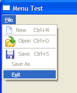
WTF? For starters, some of the png icons have been scaled up, but the "new_document_16" file was unscaled. The menu items with icons don't line up vertically with those below. The keyboard hints to the right of the items don't align vertically either.
If this is the standard UI for menus, I can totally see why developers are avoiding them. Is it so hard to make a menu look like a standard Windows menu? Why do menus look like this by default in WPF?
Perhaps Paul, Douglas, Joseph or Josh could shed some light on this.
Comments
# Douglas Stockwell
10/05/2007 11:51 AM
This should solve the alignment:
<MenuItem Header="_File" Grid.IsSharedSizeScope="True">
The scaling is strange, do the images all have the same DPI?
# mabster
10/05/2007 12:19 PM
I'll give that XAML a go, Doug.
As for the DPI of the images: That's a really good point! These are standard images from glyfx.com, so I would have thought so, but you might be on to something.
# mabster
10/05/2007 12:21 PM
BAM! Dead on target, Doug! The "new" icon is 96dpi but the other two are 72dpi! Well spotted! I guess I can adjust them in Paint.NET to fix that particular issue.
# jan
2/06/2007 10:32 AM
is there any way using XAML to make the images display ignoring the DPI setting and instead use the pixel sizes only ?
# mabster
2/06/2007 10:59 AM
Yeah, Jan, I wonder that myself. Need to do some more reading, I think.
# stynes
30/06/2007 12:58 PM
I've tried implemeting your code example to display an icon beside my menu items. The icons show up fine in Expression but they don't appear when I run the app. It's a little bizzaire. Any ideas?
# mabster
30/06/2007 1:45 PM
Bit weird, stynes!
I've not used Expression, so I don't know what could be causing it. Can you view the XAML that Expression has generated? Does it look similar to the code above?
# Chris
18/10/2007 6:03 AM
Have you tried data binding with menuitem's Icon? Along the lines of:
<Image Width="16" Height="16" Source="{Binding Path=Icon}"/>
It doesn't seem to work properly at all?
# mabster
18/10/2007 8:30 AM
That would only work if the object your menu item was bound to had an "Icon" property, Chris.
If you want to bind the menuitem's icon, you would need to use a ControlTemplate to define your menuitems and use TemplateBinding instead of just Binding.
# eric burke
30/01/2008 4:14 PM
usually you can overcome DPI issues with images by specifying at least one Width or Height dimension (if Stretch = Uniform, otherwise specify Width and Height), or using a ScaleTransform where you specify a scale of X/96 where X = the DPI of the image (because it will get scaled by 96/X).
# Brenden
24/04/2008 1:29 PM
Hi all,
Here is a newbies "dumb" question. Taking Mabsters example above - How do you activate the menu items themselves?
When I make my own menus and use commands such as Open, SaveAs, Print, etc, they are not active so can't be clicked. I know I am missing something so obvious but can't figure it out. Any help would be appreciated!
Thanks.
P.S. Great site!
# mabster
24/04/2008 3:09 PM
I think I can answer that one, Brenden. Try giving your menus a "Click" event handler. Unless WPF knows that something will happen when the menus are clicked, it'll make them disabled. I think that's kind of cool, actually.
# Brenden
27/04/2008 2:41 PM
Thanks, Mabster. Unfortunately my menu items are still not active. I must be missing something :)
I'll play around some more.
# Bill M
29/04/2008 11:58 AM
I'm trying to convert the code to run in a WPF Browser App. everything is fine except for the child items. I'm having trouble converting the Windows WPF line into the browser page format
If TypeOf value Is Integer Then
Dim objWindow As ApplicationMainWindow = CType(App.Current.MainWindow, ApplicationMainWindow)
Return objWindow.GetChildItems(DirectCast(value, Integer))
Else
Return Nothing
End If
It seems that a page cannot be cast into a window (sounds right) so can you point me in the right direct to format that line so that the child menu items get listed. Great code and thanks